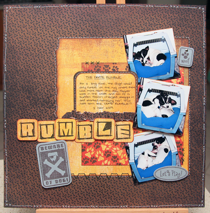
I did a layout last week that I want to share with you all. It was done for the UKS Sketches SG.
This was the sketch (from the Scrap-a-gogo Create & Co blog):
And this is my version of it:
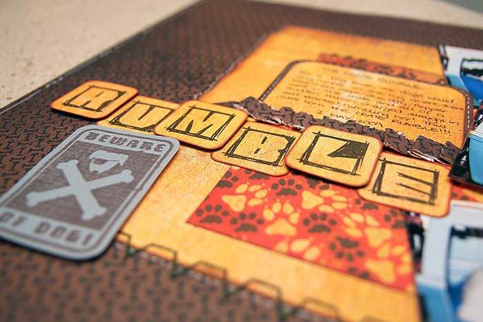
More close-up photos:
Supplies used: Basic Grey Max & Whiskers, DCWV cardstock, Autumn Leaves "Pete's Dog" Clear Stamps, HeroArts "I Love My Dog" Clear Stamps, title printed and cut out (font used was Graphic Attitude), green DMC embroidery thread, white & black pens, silver brad.
I'm not completely happy with it as I think it looks very boring, but I'm very short on ideas for dog embellishments and how to make this layout look any better. Leave me a comment and let me know what you think. :D
*hugs*
Tuesday, 10 August 2010
Subscribe to:
Post Comments (Atom)


2 comments:
Let's hope Blogger plays nice this time.
I love your LO Winnie, the colours are great and I think it works well "as is".
Toni :o)
I like it Winnie :) It can't be boring with all that fab texture going on!
Really sorry about your comments disappearing, what a pain :(
Post a Comment